
Can you see it?
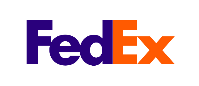
Take a look between the E and x. There’s an arrow hidden in plain sight, proudly pointing FedEx forward with an absolutely genius use of negative space and clever kerning. It’s a practically perfect logo. A timeless example of true marketing ingenuity.
And it was a complete accident.
“Farthest from our minds was the idea of an arrow,” Lindon Leader, who designed the logo in 1994, said in an CNN interview. “But in an internal critique midway in the logo exploration, I was intrigued by a design that had very tightly spaced letters.”
A company’s logo is its identity. From the elegant precision of financial firms to the goofy charm of your local hot dog stand, a logo is the opening chord to a song that tells the story of your brand.
After going through over 400 potential designs with his team, Leader stumbled upon a logo that would become an overnight sensation.
“It dawned on me that if a genuine arrow could be introduced into the letterforms, it could subtly suggest getting from point A to point B reliably, with speed and precision,” said Leader.
The arrow is formed with such subtlety that the driver will be down the block before most of us have a chance to pick out the parcel’s hidden point.
“The prevailing notion is – I’ve heard – that perhaps less than one in five people find the hidden arrow unaided. But I can’t tell you how many people have told me how much fun they have asking others if they can spot something in the logo.”
Fun, clever, serious, serene, your logo is the signature that signals who you are and what you can deliver to your audience. So express yourself.

Leave a comment